はじめに
Next.jsでMaterial-UIを利用する方法を紹介します。
Material-UIとは
Material-UIは、マテリアルデザインのReactコンポーネントを簡単に取り入れられるライブラリです。

MUI: The React component library you always wanted
MUI provides a simple, customizable, and accessible library of React components. Follow your own design system, or start with Material Design.
Next.jsでMaterial-UIを使うと
特に何も気にせずNext.jsのアプリにMaterial-UIを取り入れると以下のようなエラーが出てきます。
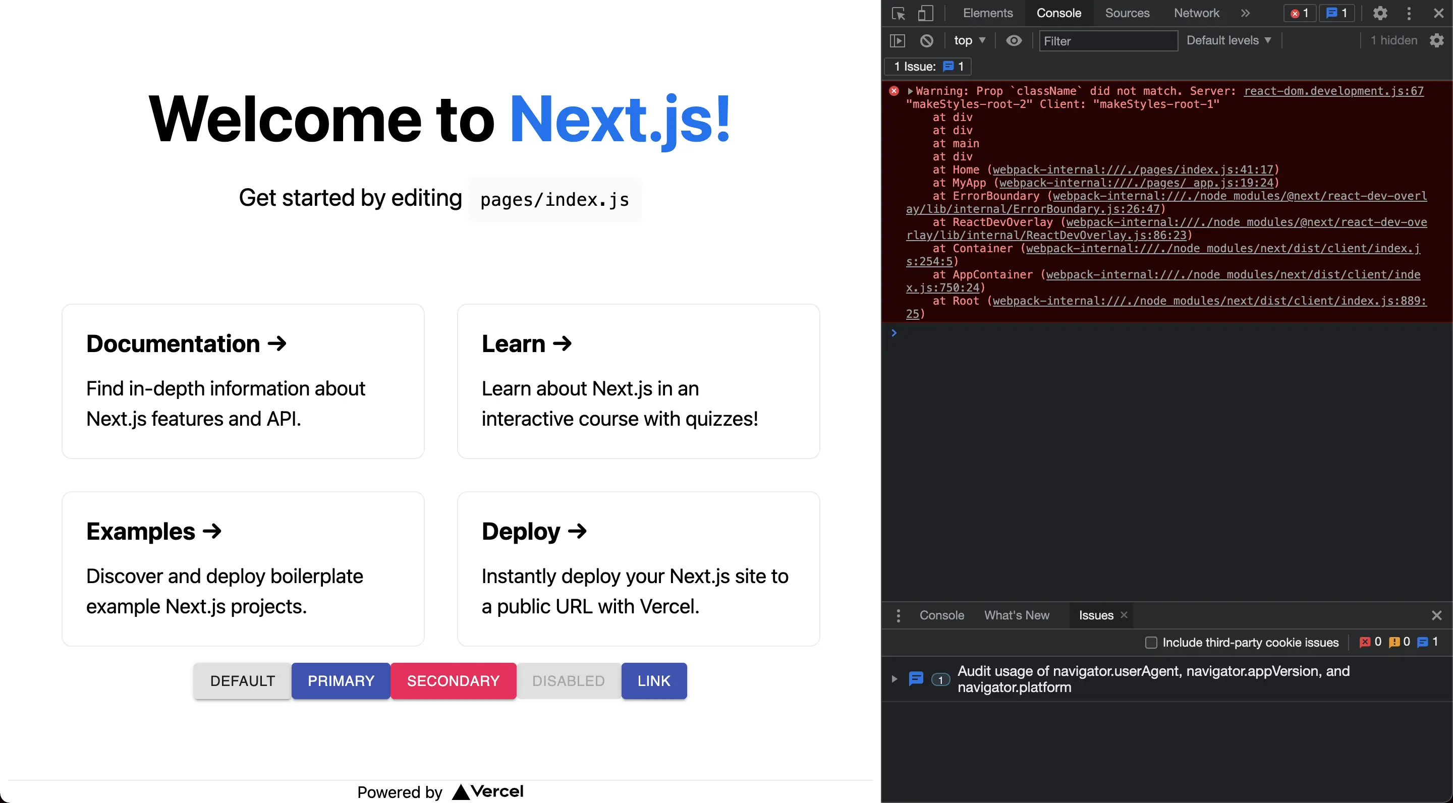
公式のドキュメントには以下のように説明されています。
Material-UIは、サーバーでのレンダリングの制約を考慮してゼロから設計されましたが、正しく統合されるかどうかはユーザー次第です。 サーバサイドレンダリングでは必要とされるCSSが正しく渡される必要があります。(ドキュメントより)
つまり、SSR(サーバサイドレンダリング)に対応できるが、利用するときに正しくCSSを渡すように設定する必要があるみたいです。
Next.jsでMaterial-UIを使う方法
Next.jsアプリでMaterial-UIを使うときには下記のファイルに変更が必要です。
_app.js_document.js
どちらもほぼMaterial-UIのリポジトリのサンプルコードをコピペするだけになります。
unknown linkアプリの作成
まずはNext.jsのアプリを作成します。
1❯ npx create-next-app material-ui-app --use-npmNext.jsのアプリ作成についてはこちらでも解説しています。
【Next.js初めの一歩】アプリを作成する
はじめに Next.jsでアプリを作成する方法を紹介します。 Next.jsでアプリ作成 手
Material-UIのインストール
npmでMaterial-UIをインストールします。
1❯ npm install @material-ui/coreコンポーネントを使う
index.jsにMaterial-UIのボタンを追加します。
今回利用したコンポーネントは下記になります。
React Button component - Material UI
Buttons allow users to take actions, and make choices, with a single tap.
1import Head from 'next/head'
2import Image from 'next/image'
3import styles from '../styles/Home.module.css'
4import React from 'react';
5import { makeStyles } from '@material-ui/core/styles';
6import Button from '@material-ui/core/Button';
7
8const useStyles = makeStyles((theme) => ({
9 root: {
10 '& > *': {
11 margin: theme.spacing(1),
12 },
13 },
14}));
15
16export default function Home() {
17 const classes = useStyles();
18 return (
19 <div className={styles.container}>
20 <Head>
21 <title>Create Next App</title>
22 <meta name="description" content="Generated by create next app" />
23 <link rel="icon" href="/favicon.ico" />
24 </Head>
25
26 <main className={styles.main}>
27 <h1 className={styles.title}>
28 Welcome to <a href="https://nextjs.org">Next.js!</a>
29 </h1>
30
31 <p className={styles.description}>
32 Get started by editing{' '}
33 <code className={styles.code}>pages/index.js</code>
34 </p>
35
36 <div className={styles.grid}>
37 <a href="https://nextjs.org/docs" className={styles.card}>
38 <h2>Documentation →</h2>
39 <p>Find in-depth information about Next.js features and API.</p>
40 </a>
41
42 <a href="https://nextjs.org/learn" className={styles.card}>
43 <h2>Learn →</h2>
44 <p>Learn about Next.js in an interactive course with quizzes!</p>
45 </a>
46
47 <a
48 href="https://github.com/vercel/next.js/tree/master/examples"
49 className={styles.card}
50 >
51 <h2>Examples →</h2>
52 <p>Discover and deploy boilerplate example Next.js projects.</p>
53 </a>
54
55 <a
56 href="https://vercel.com/new?utm_source=create-next-app&utm_medium=default-template&utm_campaign=create-next-app"
57 className={styles.card}
58 >
59 <h2>Deploy →</h2>
60 <p>
61 Instantly deploy your Next.js site to a public URL with Vercel.
62 </p>
63 </a>
64
65 <div className={classes.root}>
66 <Button variant="contained">Default</Button>
67 <Button variant="contained" color="primary">
68 Primary
69 </Button>
70 <Button variant="contained" color="secondary">
71 Secondary
72 </Button>
73 <Button variant="contained" disabled>
74 Disabled
75 </Button>
76 <Button variant="contained" color="primary" href="#contained-buttons">
77 Link
78 </Button>
79 </div>
80 </div>
81 </main>
82
83 <footer className={styles.footer}>
84 <a
85 href="https://vercel.com?utm_source=create-next-app&utm_medium=default-template&utm_campaign=create-next-app"
86 target="_blank"
87 rel="noopener noreferrer"
88 >
89 Powered by{' '}
90 <span className={styles.logo}>
91 <Image src="/vercel.svg" alt="Vercel Logo" width={72} height={16} />
92 </span>
93 </a>
94 </footer>
95 </div>
96 )
97}theme.jsの作成
_app.jsと_document.jsで読み込むMaterial-UI全体に適用するテーマを作成します。
サンプルコードではsrc/配下に格納されていましたが、ここでは一旦pages/配下に保存します。
1import { createTheme } from '@material-ui/core/styles';
2
3// Create a theme instance.
4const theme = createTheme({
5  palette: {
6    primary: {
7      main: '#556cd6',
8    },
9    secondary: {
10      main: '#19857b',
11    },
12  },
13});
14
15export default theme;
_app.jsの作成
_app.jsを下記のように変更します。themeのパスを変更しているだけでほぼコピペで大丈夫です。
1import React from 'react';
2import PropTypes from 'prop-types';
3import Head from 'next/head';
4import { ThemeProvider } from '@material-ui/core/styles';
5import CssBaseline from '@material-ui/core/CssBaseline';
6import theme from './theme';
7
8export default function MyApp(props) {
9  const { Component, pageProps } = props;
10
11  React.useEffect(() => {
12    // Remove the server-side injected CSS.
13    const jssStyles = document.querySelector('#jss-server-side');
14    if (jssStyles) {
15      jssStyles.parentElement.removeChild(jssStyles);
16    }
17  }, []);
18
19  return (
20    <React.Fragment>
21      <Head>
22        <title>My page</title>
23        <meta name="viewport" content="minimum-scale=1, initial-scale=1, width=device-width" />
24      </Head>
25      <ThemeProvider theme={theme}>
26        {/* CssBaseline kickstart an elegant, consistent, and simple baseline to build upon. */}
27        <CssBaseline />
28        <Component {...pageProps} />
29      </ThemeProvider>
30    </React.Fragment>
31  );
32}
33
34MyApp.propTypes = {
35  Component: PropTypes.elementType.isRequired,
36  pageProps: PropTypes.object.isRequired,
37};
_document.jsの作成
_document.jsを作成します。こちらもthemeのパスを変更しているだけで、ほぼコピペで大丈夫です。
1import React from 'react';
2import Document, { Html, Head, Main, NextScript } from 'next/document';
3import { ServerStyleSheets } from '@material-ui/core/styles';
4import theme from './theme';
5
6export default class MyDocument extends Document {
7  render() {
8    return (
9      <Html lang="en">
10        <Head>
11          {/* PWA primary color */}
12          <meta name="theme-color" content={theme.palette.primary.main} />
13          <link
14            rel="stylesheet"
15            href="https://fonts.googleapis.com/css?family=Roboto:300,400,500,700&display=swap"
16          />
17        </Head>
18        <body>
19          <Main />
20          <NextScript />
21        </body>
22      </Html>
23    );
24  }
25}
26
27// `getInitialProps` belongs to `_document` (instead of `_app`),
28// it's compatible with server-side generation (SSG).
29MyDocument.getInitialProps = async (ctx) => {
30  // Resolution order
31  //
32  // On the server:
33  // 1. app.getInitialProps
34  // 2. page.getInitialProps
35  // 3. document.getInitialProps
36  // 4. app.render
37  // 5. page.render
38  // 6. document.render
39  //
40  // On the server with error:
41  // 1. document.getInitialProps
42  // 2. app.render
43  // 3. page.render
44  // 4. document.render
45  //
46  // On the client
47  // 1. app.getInitialProps
48  // 2. page.getInitialProps
49  // 3. app.render
50  // 4. page.render
51
52  // Render app and page and get the context of the page with collected side effects.
53  const sheets = new ServerStyleSheets();
54  const originalRenderPage = ctx.renderPage;
55
56  ctx.renderPage = () =>
57    originalRenderPage({
58      enhanceApp: (App) => (props) => sheets.collect(<App {...props} />),
59    });
60
61  const initialProps = await Document.getInitialProps(ctx);
62
63  return {
64    ...initialProps,
65    // Styles fragment is rendered after the app and page rendering finish.
66    styles: [...React.Children.toArray(initialProps.styles), sheets.getStyleElement()],
67  };
68};
確認
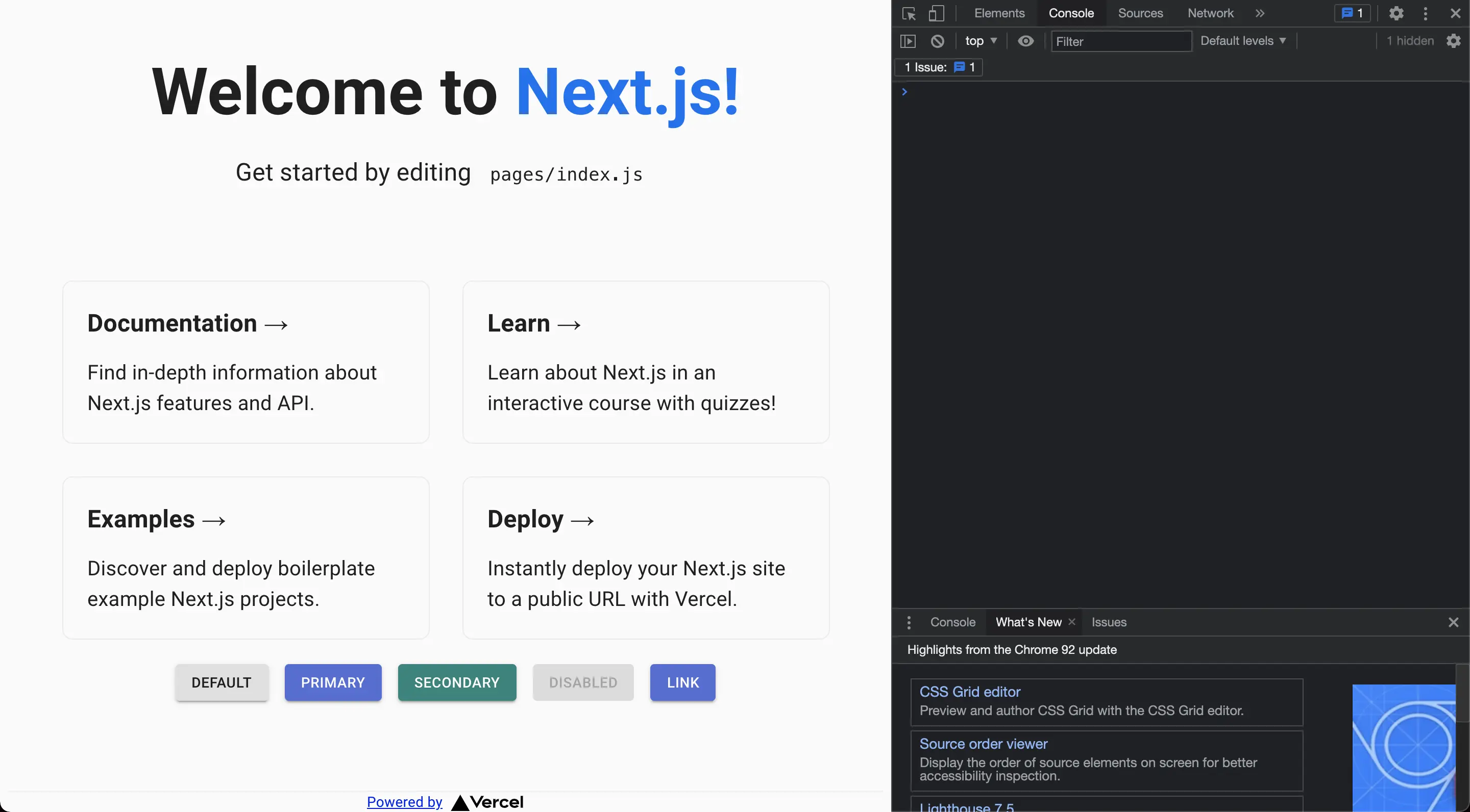
以上の設定でMaterial-UIがエラーなく使えるようになりました。テーマを追加しているので、ボタンの色も変更されています。
まとめ
Material-UIを利用するには下記のファイルを修正する必要がありました。
- _app.js
- _document.js
ただ、まだ課題があります。
_app.jsと_document.jsに余分な部分がまだある- ディレクトリ構造をどうしたらいいのか(theme.jsはどこに格納すべきか)
こちらは調べしだい記事にしたいと思います。
参考
- Material-UI: A popular React UI framework
- Server Rendering - Material-UI
- material-ui/examples/nextjs at master · mui-org/material-ui
\ この記事が役に立ったと思ったら、サポートお願いします! /

関連記事
【Next.js初めの一歩】アプリを作成する
いまさらFlask超入門
Flask+uWSGI+NginxでWSGIを試してみる