Support
\ この記事が役に立ったと思ったら、サポートお願いします! /

Share
関連記事

NeuralProphetで時系列データ予測
2021.07.25

KerasのFunctional API で多入力・多出力モデル
2021.05.18

【入門機械学習】動かして理解する人工知能・機械学習・ディープラーニングの違い
2021.05.16

Prophetで時系列データ予測
2021.06.27
\ この記事が役に立ったと思ったら、サポートお願いします! /
scikit-learnを使って、データを正規分布のように変換する方法を紹介します。
PowerTransformerでは、Yoe-JohnsonとBox-Coxでの変換が可能です。

PowerTransformer
Gallery examples: Compare the effect of different scalers on data with outliers Map data to a normal distribution
1pt = PowerTransformer(method='yeo-johnson')
2pt.fit(df[cols].values)
3df[cols] = pt.transform(df[cols].values)こちらは負の値が扱えないことに注意してください。
1pt = PowerTransformer(method='box-cox')
2pt.fit(df[cols].values)
3df[cols] = pt.transform(df[cols].values)QuantileTransformerは分位数を使って正規分布に変換します。

QuantileTransformer
Gallery examples: Effect of transforming the targets in regression model Partial Dependence and Individual Conditional Expectation Plots Compare the effect of different scalers on data with outlier...
n_quantilesで分位数の数を設定できます。
1qt =  QuantileTransformer(n_quantiles=100, output_distribution='normal', random_state=42)
2qt.fit(df[cols].values)
3df[cols] = qt.transform(df[cols].values)Kaggleのtitanicデータを使って実際にそれぞれ変換してみます。

Titanic - Machine Learning from Disaster
Start here! Predict survival on the Titanic and get familiar with ML basics
今回は、AgeとFareのデータを変換してみます。
まずデータを読み込んで、今回は試してみるだけなので欠損データと負の値のデータを削除してしまいます。
1from sklearn.preprocessing import PowerTransformer, QuantileTransformer
2import pandas as pd
3import seaborn as sns
4import matplotlib.pyplot as plt
5sns.set()
6
7df = pd.read_csv('../input/titanic/train.csv')
8df = df.dropna(subset=cols)
9df = df[df['Fare']>0]
10
11cols = ['Age', 'Fare']
12
13df = df.dropna(subset=cols)
14df = df[df['Fare']>0]元のデータの分布はそれぞれ下記の通りになります。
1fig, axes = plt.subplots(1, 2, figsize=(20, 10))
2axes = axes.ravel()
3
4for col, ax in zip(cols, axes):
5    sns.histplot(df[col], ax=ax)
6
7plt.show()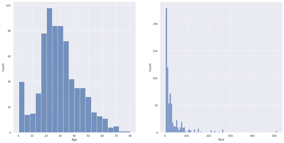
PowerTransformer(Yeo-Johnson)で変換します。
1yj_cols = ['Age_yj', 'Fare_yj']
2pt = PowerTransformer(method='yeo-johnson')
3pt.fit(df[cols].values)
4df[yj_cols] = pt.transform(df[cols].values)
変換した後の分布は下記のようになります。
1fig, axes = plt.subplots(1, 2, figsize=(20, 10))
2axes = axes.ravel()
3
4for col, ax in zip(yj_cols, axes):
5    sns.histplot(df[col], ax=ax)
6
7plt.show()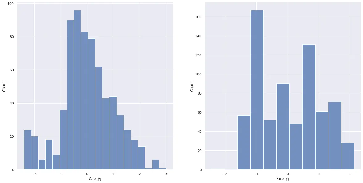
PowerTransformer(Box-Cox)で変換します。
1bc_cols = ['Age_bc', 'Fare_bc']
2pt = PowerTransformer(method='box-cox')
3pt.fit(df[cols].values)
4df[bc_cols] = pt.transform(df[cols].values)
変換した後の分布は下記のようになります。
1fig, axes = plt.subplots(1, 2, figsize=(20, 10))
2axes = axes.ravel()
3
4for col, ax in zip(bc_cols, axes):
5    sns.histplot(df[col], ax=ax)
6
7plt.show()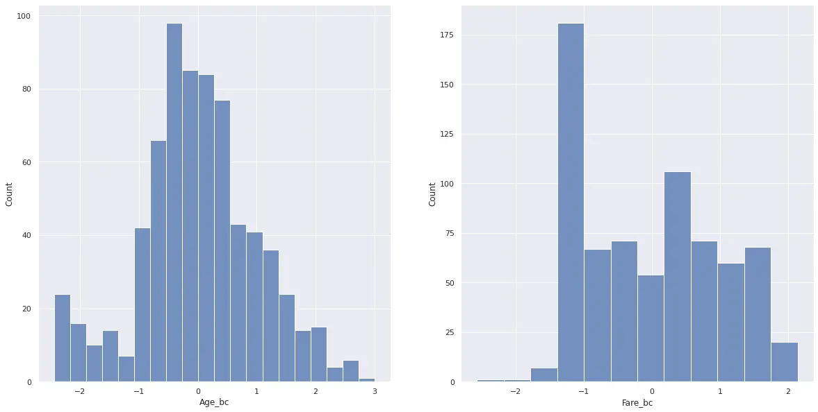
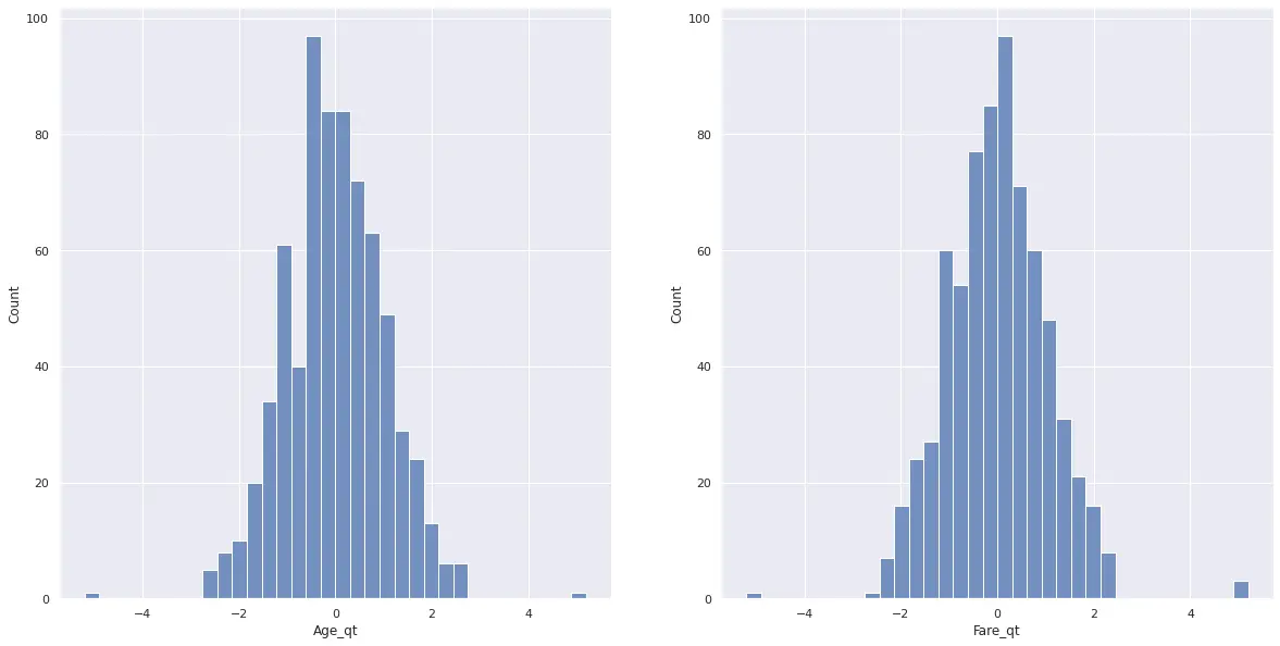
QuantileTransformerで変換します。
1qt_cols = ['Age_qt', 'Fare_qt']
2qt =  QuantileTransformer(n_quantiles=100, output_distribution='normal', random_state=42)
3qt.fit(df[cols].values)
4df[qt_cols] = qt.transform(df[cols].values)
変換した後の分布は下記のようになります。
1fig, axes = plt.subplots(1, 2, figsize=(20, 10))
2axes = axes.ravel()
3
4for col, ax in zip(qt_cols, axes):
5    sns.histplot(df[col], ax=ax)
6
7plt.show()